
Business
Capitol Hill Books - DC
Lead Designer
Role
Duration
2 Week Design Sprint
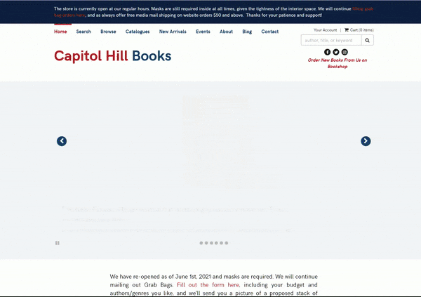
Original Site
Users needs a quick way to find books through Capitol Books, so that they can purchase a recommended or preferred book as a gift.
PROBLEM
Capitol Hill Books DC is a local bookstore that specializes in book maintenance and literary history. A major part of their business model is ecommerce on their desktop website. However, many users I interviewed had problems with the legacy features of the site alongside having a hard time to find books.
PROPOSED SOLUTION
Too many categories » Created broader categories with subcategories implemented into the main category page + Placed search with suggestive searching as main call to action being above header slideshow
Want to add to cart from any page » Added quick cart feature to all products on any page with products
Sections to see recommended or other collections from the home page » Adding collection carousels with book products on home page
BUT WHY? HOW? WHAT'S THE PROCESS???
How Might We solve this problem?
What to keep in mind?
-
HMW improve the searchability on the site when browsing through categories?
-
HMW make a possible way to find recommendations and quickly?
-
HMW make sure users have a speedy and secure checkout process from any page on the site?
-
HMW increase the speed of the process from finding a book to getting to checkout?
-
Users need to be able to browse the home page and find collections or categories (Best Sellers, 10&Under, etc.,) that apply to their gift criteria, Users will then add products to cart from collection or purchase with a quick shop modal.
-
Users will browse all products, filter the product list to match their gift criteria, add the product/s to their cart from the product page or with a quick add modal, Users will then finalize their purchase by checking out with the cart.
Field Studies
Beginning with field studies into Capitol Hill Books demographics and site data, I sicovered an important insight;
Majority of Capitol Hill Users are aged 25 and up


Competitive Analysis
Analyzing 5 competitors, indrect and indirect, I was able to familiarize myself with the online model for book shopping.
Research Process


Card Sorting
Evident from the results, Users would prefer to find a studies or education section for their study subjects rather than individually try and find each subject as a category.
Usability Testing on original site
Task 1:
Can you click on any product and proceed to checkout as if you were purchasing
within 3 minute of arriving at the site?
- How was the process?
- Did you know what to do?
- Were there any errors you faced or moments of confusion in the functionality of
completing that task?
Task 2:
Can you search for a mickey mouse book within the next 2 minutes and then proceed to checkout similar to task 1?
- How did you feel doing the search process?
- What ways do you normally search for products in an online store?
- Were there any moments of confusion?
Task 3:
Using the categories, can you try and find a book called Pinocchio?
- How was the process for finding the book?
- Did you have any confusion in locating the right category?
- Are these categories normal for you when searching for a book?
Final questions
- Did you enjoy using the site to complete the tasks?
- Is there anything that bothered you or ruined your experience as a user?
- Is there anything you enjoyed that heightened your experience as a user?


Once I reviewed the results and synthesized the data, I was able to find that users preferred to group categories broadly rather than being broken down specifically as the current site has done. Using key insight from user quotes and data, I found that these common themes were to categorize the books by their respective subject rather than to individualize them into separate categories. Users wanted a streamlined process with minimal effort from their end to find a product.
Understanding Our Users
Research Takeaways


Retrospective User Journey Map

Design Process
The beginning of the design phase was focused on creating a sitemap to understand what pages were needed to understand the user’s intentions and the site’s layout. Breaking down the site’s mapping of clickable pages allowed me to see what was necessary to sketch for my user Gerald and those facing problems like him.

User Flows


Now, we Sketch!


Sketching out the first ideas that came to mind with regard to the persona I was ideating for was the next step. The focus was to create screens that allowed for the collections to exist such as recommended or popular, then I ideated ways the subcategories can exist within broad category pages. Giving myself a timebox of 1 hour minutes for the sketches allowed me to begin constructing wireframes to see how the designs could exist on desktop and mobile screens. Through further sketching and review of my data from the user interviews, I began to sketch in features that created possible solutions to the problem while implementing the goals of the user. From then on the wireframes took shape as mentioned before. Being able to visualize the user’s process with the intended design let me create a wireflow for the checkout process alongside the process of finding a book and adding it to the cart based on what route you used to find that book.
Wireframes to Mid-Fidelity Screens

Search Bar Placement - Moved search bar to be focal point for user to quickly access products
Quick Cart Icon - Easily add products to cart from any page with products
Product Carousel - Easily access book collections and featured products
Larger Category Cards - Changed the layout of the Browse Section to feature large cards for easy readability
Broader Category Selections - Easier to access category selection titles for quicker searching
Can still access every category - Underneath broad categories, users can still view all categories available


More Filter Options - Moved search bar to be focal point for user to quickly access products
Quick Cart Icon - Easily add products to cart from any page with products
Sub-category Carousel - Easily access book collections and featured products

Redesign Product Page - Product page has been redesigned for more accessibility
Focus on Product Description and information - Users can see all product information with more visual clarity and spacing
Usability Testing
I can test the mid-fidelity prototype through a round of usability testing. Through 5 participants with 3 of them being a follow up from the current site usability test, we were able to get some more actionable insights about whether we solved some user problems and how we can improve upon the changes made.

Key takeaways were the implementation of the Quick Cart feature which allowed for users to add a product to their cart at a rate 10 seconds faster than the current site.
Additionally, Users were able to find products within 1 minute successfully.
The 3 follow-up Users stated that they expressed the sensation of being overwhelmed was gone when they used broad categories,
All users stated they found the search bar being a focal point of the desktop site using the suggestive searching to speed up their process.
The majority of users expressed joy towards the visual changes of the desktop website and felt it was more of an e-commerce experience, making their online shopping more viable and manageable.

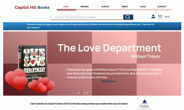
Final Prototype
What's Next?
After making so many improvements and verified changes, where are we now? What’s Next, and where do we go from here? Today, we are currently about to begin another round of usability testing to make sure the changes we made, for the high fidelity prototype, can be conclusive with real-time data. After that, we are going to reach out to users like Gerald, whom many of these changes benefit, and perform an additional study on their usage of the site. We will lastly, use the information from these studies to iterate our mobile designs to provide a deliverable product on all devices and screen size.
Next steps to implement within the design process are to continue reviews of the data regarding another round of usability testing on the high-fidelity prototype, improve the designs and mockups to meet user recommendations. By continuing to focus on the goals of the user, we can keep changes to a minimum while getting responsive feedback on each iteration before a final product exists.